Dashboard
Monitor platform activity with usage charts, programmable access analytics, and top credential usage
The Dashboard gives you an at-a-glance view of your AI assistant's activity and performance. Four metric cards summarize request volume, response speed, answer quality, and user engagement. Below them, interactive charts break down usage by time, channel, confidence level, and response time — and when programmable traffic is present, additional charts surface interface mix, block rate, caller type, and the credentials driving the most requests.
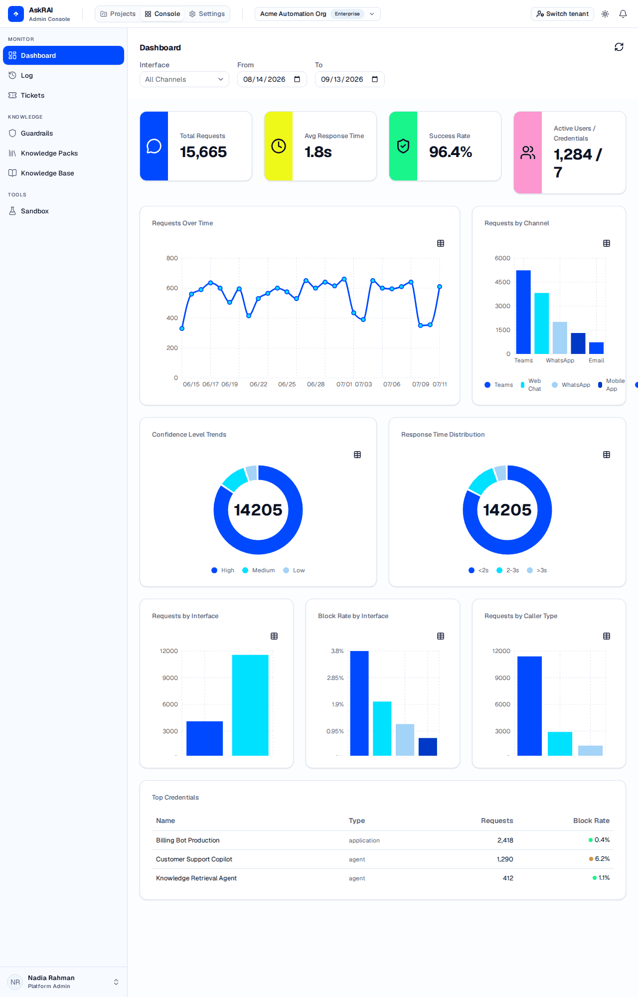
The Dashboard combines interactive KPIs with usage charts and programmable access analytics.
Metrics cards
Four cards at the top of the page show your tenant's key performance indicators for the selected filter range.

Metric cards update automatically whenever you change the date range or interface filter.
| Metric | Description | Unit |
|---|---|---|
| Total Requests | Number of AI requests (question/answer turns) in the selected period — a multi-turn conversation contributes one request per turn | Requests |
| Avg Response Time | Mean time the AI takes to generate a response | Seconds |
| Success Rate | Percentage of scored responses at or above the high-confidence threshold | Percentage |
| Active Users | Count of distinct user IDs across the audit records in range | Users |
| Active Users / Credentials | Shown when a credential-issued request is present — distinct user IDs and distinct active service credentials | Users / Credentials |
The Success Rate metric uses your tenant's configured confidence thresholds. Adjust them in Confidence Thresholds to change what counts as a high-confidence response.
When a service credential produced at least one request in the selected range, the fourth metric card changes its label from Active Users to Active Users / Credentials and displays a compound value such as 1,284 / 7. The first number is the count of distinct user IDs across every audit record in the range — credential-issued requests carry a user identity too, so this is not a count of interactive humans only. The second number is the count of distinct service credentials that produced at least one request.
Core charts
Requests over time
A line chart showing daily request volume across the selected range. Use it to identify usage patterns, spot traffic spikes, and track adoption trends.
- X-axis — date in MM/DD format
- Y-axis — number of requests
- Days with no requests render as zero rather than gaps
- A toggle in the top-right of every chart switches the view between the visual chart and an accessible data table
Requests by channel
A bar chart breaking down request volume by messaging channel. Each channel appears in the legend above the chart. The palette holds four colours and repeats beyond that, so with many channels in range two bars can share one — read the legend rather than the colour. Use this to understand which channels your users prefer — for example, whether Teams traffic is eclipsing Web Chat.
Confidence level trends
A donut chart showing the distribution of AI confidence scores across three bands:
| Band | Criteria |
|---|---|
| High | Confidence score at or above the high threshold (default: 90%) |
| Medium | Confidence score between the medium and high thresholds (default: 60–89%) |
| Low | Confidence score below the medium threshold (default: below 60%) |
The center of the donut displays the total number of scored responses.
Response time distribution
A donut chart categorizing response times. It normally shows three buckets:
| Bucket | Range |
|---|---|
<2s | Responses generated in less than 2 seconds |
2-3s | Responses taking 2 to 3 seconds |
>3s | Responses taking more than 3 seconds |
Each bucket shows the count and percentage of total responses. Those three strings are the exact labels the UI renders — the legend, the tooltip and the accessible table all print them verbatim — and the table's columns are Range, Count and Percentage. There is no fourth bucket: the ranges are open-ended at the top and response times cannot be negative, so every measured response falls into one of the three.
Programmable Access analytics
When at least one request in the selected range came from a service credential — an API, CLI, or MCP integration — an additional row of three charts appears below the core charts. This row is hidden whenever no programmable traffic is present, so tenants that only use Teams or Web Chat continue to see the classic dashboard without visual clutter.
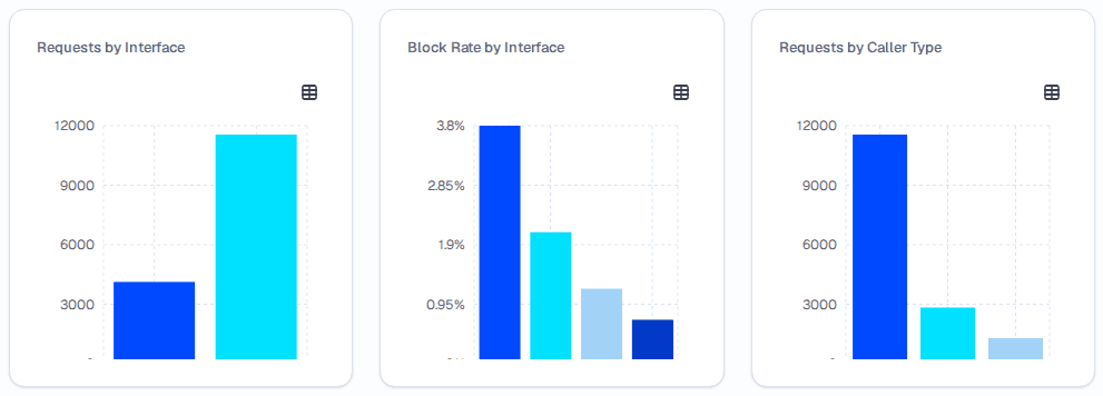
The Programmable Access row appears whenever programmable traffic is detected in the selected range.
Each of these three cards has the same chart/table toggle as the core charts. Use the table view when you need exact values — the charts are sized for a quick read, and their x-axis tick labels can be cut off at the bottom of the card.
Requests by interface
A bar chart splitting traffic into two buckets:
- programmable — requests that entered through a service credential (API, CLI, MCP)
- traditional — requests that entered through a human-facing channel (Teams, Web Chat, WhatsApp, Mobile App, SMS, Phone, Email)
Use this chart to see how much of your volume is driven by automations versus interactive users.
Block rate by interface
A bar chart showing the percentage of requests that were blocked by a guardrail. Despite its title, the breakdown is by channel, not by interface: the chart draws one bar per channel present in the range, with no programmable/traditional bucketing — so traditional channels such as Teams and Web Chat appear alongside API, CLI and MCP.
There is no aggregated programmable-vs-traditional block rate anywhere on the Dashboard. To judge "the programmable side", read the API, CLI and MCP bars individually, or set the Interface filter to Programmable Only, which restricts the chart to those channels. The accessible table's first column is headed "Interface", but its values are channel names — not the programmable / traditional buckets used by Requests by Interface.
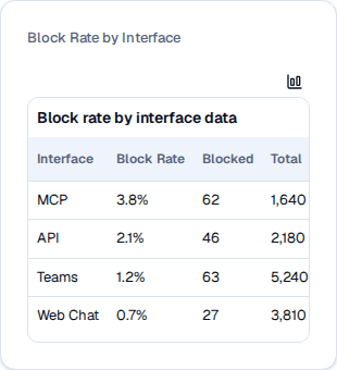
In the table view, the rows are channels — the "Interface" column header notwithstanding.
The table view also reports the Total requests and the count of Blocked requests per channel, so you can contextualize the percentage against traffic volume. A sustained high block rate on a programmable channel typically indicates that an integration is sending malformed input or hitting a content-safety rule — review the blocked requests in Conversation Logs to confirm.
Requests by Caller Type
A bar chart grouping traffic by the caller type declared on the service credential that issued the request. Caller type is a property of the credential, so only programmable requests (API, CLI, MCP) carry one:
| Caller Type | Description |
|---|---|
| Human | A credential operated by a person — for example, a personal token an engineer drives from the CLI |
| Application | Back-office services, automations, and integrations |
| Agent | AI agents that consume AskRAI through the MCP server or API |
unknown | Requests that arrived without a declared caller type — that is, all traditional-channel traffic, such as Teams and Web Chat |
Human does not mean "interactive user". Teams and Web Chat requests never declare a caller type, so they are counted in the unknown bar, not the Human one. The chart counts every request in the range — not only credential-issued ones — so in a tenant with mixed traffic unknown is normally the largest bar. Set the Interface filter to Programmable Only to exclude the traditional-channel traffic that fills it.
This chart lets you see at a glance whether your agentic traffic is growing relative to human-operated and application traffic.
Top credentials
Below the Programmable Access row, a Top Credentials table lists the service credentials with the highest request volume in the selected range. The table is hidden when no credential usage exists.
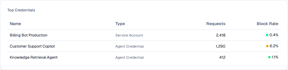
The Top Credentials table is sorted by request volume and color-codes block rate for quick triage.
| Column | Description |
|---|---|
| Name | The display name of the credential, as configured in Programmable Access |
| Type | Credential type — Personal Token, Service Account, Agent Credential, or Scoped API Key |
| Requests | Total request count in the selected date range |
| Block Rate | Percentage of the credential's requests blocked by a guardrail |
The Block Rate column uses a color dot next to the percentage:
- Green — block rate at or below 5% (healthy)
- Yellow — block rate between 5% and 20% (investigate soon)
- Red — block rate above 20% (urgent — the credential is producing frequent guardrail violations)
Click any row to jump to Programmable Access. The click opens that page, not the specific credential — locate the credential in the table there to open its details drawer or rotate its secret.
Filtering
Use the filter row in the sticky header to refine every metric and chart simultaneously.
| Filter | Options | Default |
|---|---|---|
| Interface | All Channels, Programmable Only, Traditional Only, plus an entry for every specific channel (Web Chat, Mobile App, Teams, WhatsApp, SMS, Phone, Email, API, CLI, MCP) | All Channels |
| From Date | Date picker | 30 days ago |
| To Date | Date picker | Today |
The Interface filter is the quickest way to isolate programmable traffic — pick Programmable Only to hide interactive users from every chart and metric, or pick a specific channel like MCP to focus on a single integration type.
The date range is capped at 30 days. If you select a range that exceeds this window, the end date snaps back to 30 days after the start date automatically.
All metric cards and charts update whenever you change any filter. Filter selections are preserved in the URL as query parameters, so you can bookmark or share a filtered view.
Refreshing the Dashboard
Click the refresh icon next to the page title to re-fetch all metrics and charts without changing any filters. This is useful after a burst of traffic — for example, right after a product launch — when you want to see the latest numbers without losing your current filter state.
Field reference
| Element | How it's computed |
|---|---|
| Total Requests | Count of all audit records (one per question/answer turn) in the filtered range |
| Avg Response Time | Arithmetic mean of the recorded processing time across the filtered responses |
| Success Rate | (high-confidence responses / total scored responses) × 100 |
| Active Users | Count of distinct user IDs in audit records |
| Active Credentials | Count of distinct credential IDs in audit records (programmable only) |
| Requests Over Time | Daily aggregation of request counts |
| Requests by Channel | Grouped count by channel type |
| Confidence Level Trends | Bucketed by the tenant's High/Medium/Low thresholds |
| Response Time Distribution | Bucketed into <2s, 2-3s, and >3s |
| Requests by Interface | Grouped into Programmable and Traditional |
| Block Rate by Interface | Blocked requests as a percentage of total, per channel, rounded to 2 decimals — blocked counts the requests a guardrail stopped |
| Requests by Caller Type | Grouped by the credential's Human, Application or Agent caller type; requests that declare none fall into unknown |
| Top Credentials | Top-N credentials by request count with per-credential block rate |
Related pages
- Conversation Logs — drill into individual conversations and filter by caller type
- Programmable Access — manage service credentials surfaced in the Top Credentials table
- Tickets — review escalated conversations driven by low-confidence responses
- Confidence Thresholds — adjust the bands that drive Success Rate and the Confidence Level chart